
A Question and Answer approach inspired by questions from clients, readers, and viewers on YouTube.
Video also here on YouTube.
How do I distinguish True Autumn white from Spring ivory?
In the image below, items to the left of the vertical line are examples of True Autumn white. Colours to the right of the line didn't seem quite right and we'll talk about why.

Shopping information: https://urstyle.fashion/styles/3619345
The earrings in the second row may be an average example of how True Autumn white would appear in a swatch or paint. They are also the lightest of the whites on this side, and the reflected light is lighter, both good for True Autumn. Compare the earrings to the T-shirt (top item, right of line). If I asked which is more beige or gold and which is more peach or yellow, you might say that the earrings are beige and the top is peach. The blouse below the T-shirt is even lighter and has the same peach tone. Gold is autumn warmth and yellow is Spring warmth, making these yellow-peach tones better for Spring.
For the other True Autumn whites, they contain quite a lot of pigment, compared with the third item to the right of the line, which is not necessarily too light but it is somehow too soft, or perhaps lightweight, an item to see in person before deciding for True Autumn.
The lower item, right of line, may be a colour for Dark Autumn. The muting and darkness look great for Autumn and the warmth is more gold than peach, but the colour is approaching true white, suggesting that Winter may have influence, although not white enough to belong with Winter.
How do I choose light neutrals other than white?
Moving through a light to dark range from top to bottom, with items to the right of the line being questionable for True Autumn.
Each panel shows many similar neutrals that may be in your True Autumn palette, or appear in a variation of these colours. As long as the choices are harmonious with the Season's colour dimensions, the colour might work well. If each item in the image were divided into thousands of pixels or puzzle pieces, we might have thousands of good contenders for True Autumn.
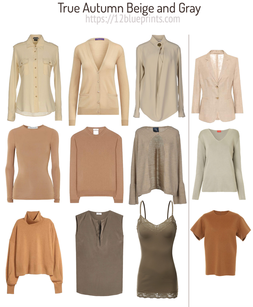
Shopping information: https://urstyle.fashion/styles/3622799
As with the whites, some colours have more beige or gold tendency and others have more visible red tones. The two beige sweaters in the centre row and the golden turtleneck in the lower row may be in different strips of the palette, possibly the brown neutrals and yellows, all acting as acceptable neutrals. The khaki greens at the ends of each row and centre of the lower row may also be found in different strips in the palette, such as the neutrals and greens, and are compatible neutrals with the colours in this group.
To the right side of the vertical line, the top item doesn't have the muting or darkness to fit with True Autumn colours. If we moved it into the True Autumn side, it might appear to be or be hard to discern on the page. The same effect may be observed when True Autumn people wear colours that are for other Seasons, with the facial contour becoming rounder or wider.
How do I combine light neutrals in outfits?
Now that we understand how light neutrals look for True Autumn, let's make some combinations.
Although the overall or average darkness level to aim for is medium to medium-dark, even the lighter tones have enough darkness to create a grounded and complete composition.
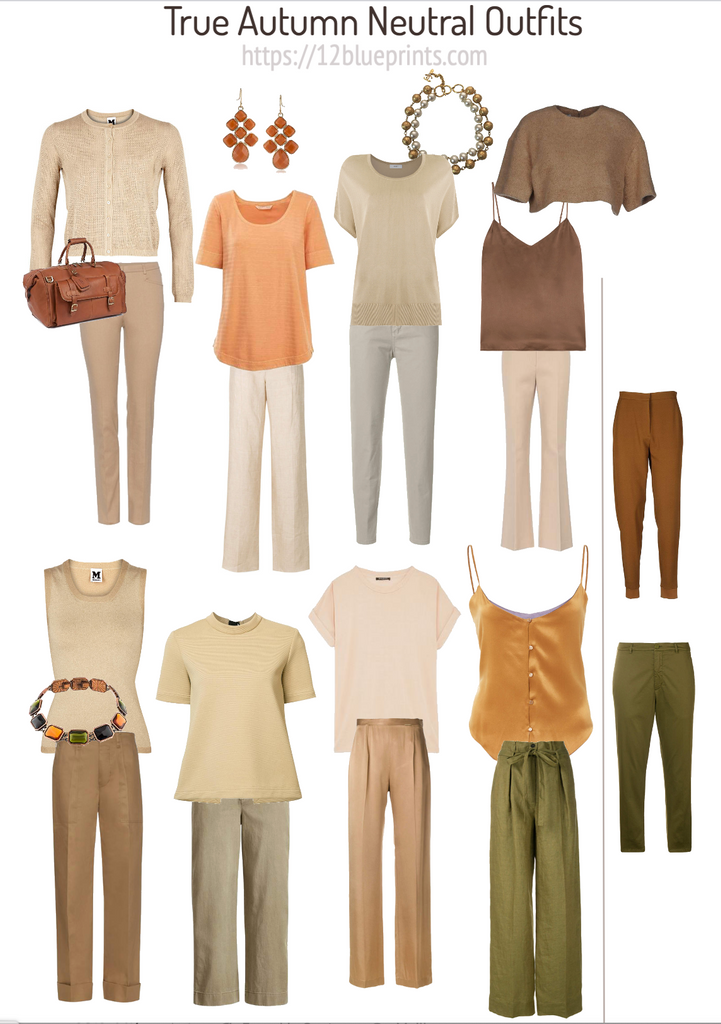
Shopping information: https://urstyle.fashion/styles/3622960
I've sprinkled in a few items of colour or darkness or shine or texture, which may be a departure from the question but if you picture this page without them, it may seem a little bland. Once we have our colour palette, there's no wrong way to use it and whether we add more colour or detail is an individual choice. I appreciated that they added movement, whether contrast of darkness, texture, or colour, making the overall effect more interesting and the outfit more complete. Compared these looks with the two outfits at the centre of the lower row, which are fine, but True Autumn people naturally have more colour variety in their appearance and stopping here may be an example of under-glamourizing oneself, depending on the occasion.
For the gray pants in the top row. Gray is a challenging colour for True Autumn, (or challenging to me) in terms of being able to recognize it from a swatch in a palette. These jeans passed one of my tests which is, do they work with all the other items on the page, without standing out or apart? They seem to work well and may be an example of True Autumn's lightest gray.
We have an orange item in the top row and a gold item in the bottom row. These might qualify as neutrals for this Season because they can be worn with any other colour in the palette in any size area without contributing an obvious colour block. Orange and gold can be a natural extension of the person, visible in the natural skin, hair, or eye colours, giving them latitude to function as neutrals.
To the right of the vertical line, the pants at the top could be an example of a True Spring medium dark to dark brown. They contain more pigment than the True Autumn browns and the colour might be called bright rather than muted. The pants below are similar to the colour just to the left with the gold top in being similar but brighter, meaning more pigmented. They might belong with Dark Autumn, and possibly Dark Autumn colours rather than neutrals, or a version of dark khaki green that might act as a neutral.
How do I choose the right shades of brown?
We might expect so much choice in True Autumn browns, but like white or navy blue, some are better than others as backgrounds for the brighter colours.
To the left of the vertical line may be examples of great browns for True Autumn. The camel coat at the top left is an example of True Autumn camel, with another version in the knee length coat just to the right of the vertical line. These are yellower and more beige options and may appear in different strips of the palette, options depending on how neutral of an effect is desired. Because the knee length coat is softer (less pigmented), it may be fine for Soft Autumn as well.

Shopping information: https://urstyle.fashion/styles/3622043
Comparing with the two coats at the top to the right of the line, these are possible but I would prefer to see them in person. The one on the left may be a good light beige for True Autumn. The coat on the right seems too gray for either True or Soft Autumn, with a greige effect that may be a good choice for Dark Autumn.
Back to the left of the line, the dark brown coat at the top is kind of a burgundy brown, and might be found with the red swatches.
Along the bottom on the True Autumn side are two coats that have a pattern or print, which adds interest, texture, and depth. The coat is the same brown as the pants, makes a great monochromatic look with light to dark variations. The darker brown pants in the centre are the same colour as the plaid in the coat, about as dark as True Autumn brown would be.
Under the knee length coat is an interesting blend of the various colours in the other coats, a little brighter for True Autumn but still terrific for that Season, repeating the variegated patterns of Autumn colours in nature.
Back to the right of the vertical line, for the two dark coats in the middle row, the one with the golden buttons is too pigmented, by comparison with the burgundy brown coat at the top of True Autumn. The dark coat is darker than the pants with the plaid coat, too near black for True Autumn and may look even darker and cooler when the True Autumn person wears it.
For the two items below, right of the line, the coat with wide lapels looks fine as a variation on True Autumn brown. By comparison, the coat to the right may be a choice for Dark Autumn. It is more spicy and bright, a little more fired up than the feeling from the True Autumn. If it were a flavour, it would be stronger or have more bite.
Pink for True Autumn
Pink for this Season is different from the traditional blossom pink. For True Autumn, pink is a variation of terracotta or coral, how soft red appears when golden warmth is added.

Shopping information: https://urstyle.fashion/styles/3622807
The three items at the top, the shoes, the shorts, and the coat, may be found with the neutral tones in your palette or with the reds. The colour might be described as soft salmon, compared with the shoe at the top of the row on the far right, which is soft pink but neither warm or pigmented enough for True Autumn. The coat in between is beautiful and the shorts are great, a light soft terracotta pink.
The items in the middle row are good contenders for True Autumn pink, with warm terracotta in the racer back tank top, that could cross over to Soft Autumn, and a darker version in the skirt below.
To the right of the racer back tank on the same side of the line, is a coral T-shirt that could work. It may look bright because it's surrounded by more neutral tones, and may be at the upper limit of True Autumn brightness with some crossover into Spring. Below the T-shirt is a lacy coral top, with beautiful rich warm tones. (I might replace the camisole with a richer, warmer white.)
The items to the right of the line have similar versions in the True Autumn palette but don't slide as easily into outfits. The sandal, as we mentioned, is not bright enough (too muted). The drawstring bag below doesn't seem to have an earthy quality, perhaps not warm, dark, or muted enough.
The tank top, third from top, right of line, is similar to the yellow and peach tones we saw with the Whites panel above, a better fit for Spring. The bag below also has visible yellow tones and might work best for Spring, but might act as an accent accessory with some True Autumn colours. The blouse as the last item may also work in either Autumn or Spring groups, although the impression has more blossom, lightweight qualities than muted or earthy.
Dark copper appears in True and Dark Autumn and Bright Spring palettes. How do I tell them apart?
For each of the 3 Seasons in the image, we have yellower and redder variations of this colour. Within a single Season, the brightness, meaning the pigment concentration, is about the same, useful for placing any colour into a Season.

Shopping information: https://urstyle.fashion/styles/3622919
Of the 3 Seasons, colours are most muted in True Autumn. The items above are shown in matte textiles, except for the wallet at the end.
In the Dark Autumn group, pigmentation is higher, with 3 items on the True to Dark Autumn border that might work well for both, rust being a signature colour for Autumn.
In Bright Spring, the pigment concentration is even higher. The colours may be considered dark yellow, orange, copper, or rust, but they’re not soft or muted. Names such as intense dark carrot, butterscotch, or ginger come to mind.
On the Dark Autumn to Bright Spring border, the bag at the top is similar to the yellow version of the intense butterscotch in the yellow strip of some Bright Spring palettes. A brown leather purse may give an Autumn impression but the pigmentation is higher than in True Autumn. The item is warm, light, and bright rand finds enough common ground with bright, warm colours to make interesting compositions.
The top with a blue diamond print shows a redder version of this colour. Dark Autumn or Bright Spring might wear the rust but only a Bright Spring will make sense of the blue. The top is also at the darkness limit for this colour family in Bright Spring, whereas True Autumn reaches a darker endpoint, and Dark Autumn is darker still.
The shirt on the Dark Autumn to Bright Spring border might also work for either Season, influenced to some degree by the natural pigmentation of the individual. The brightness may be too high for Dark Autumns with cool-appearing skin tones, or the colour may be very good for persons with similar colours in the eyes and hair.
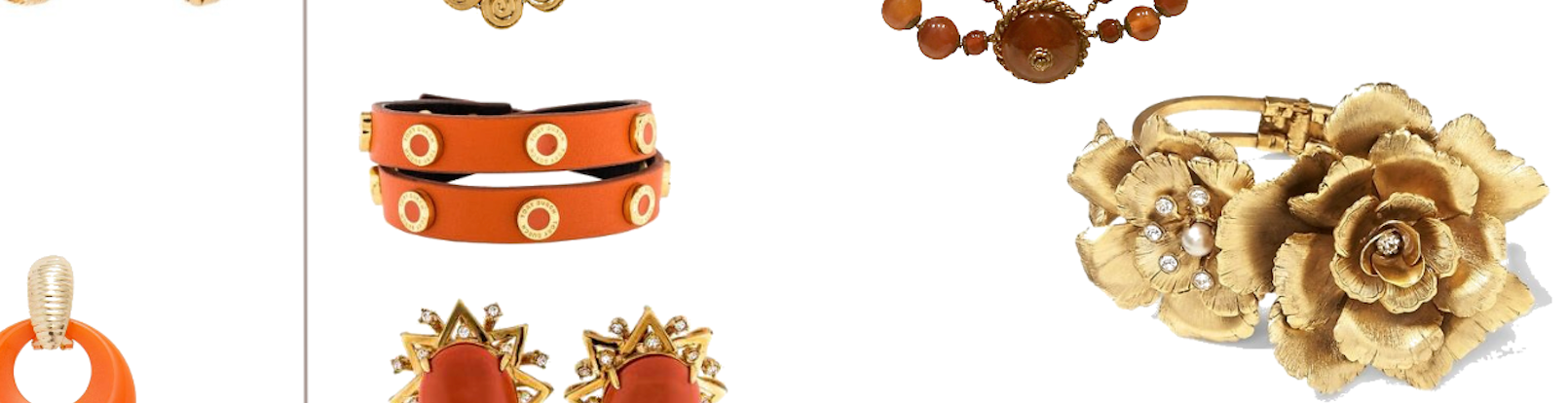
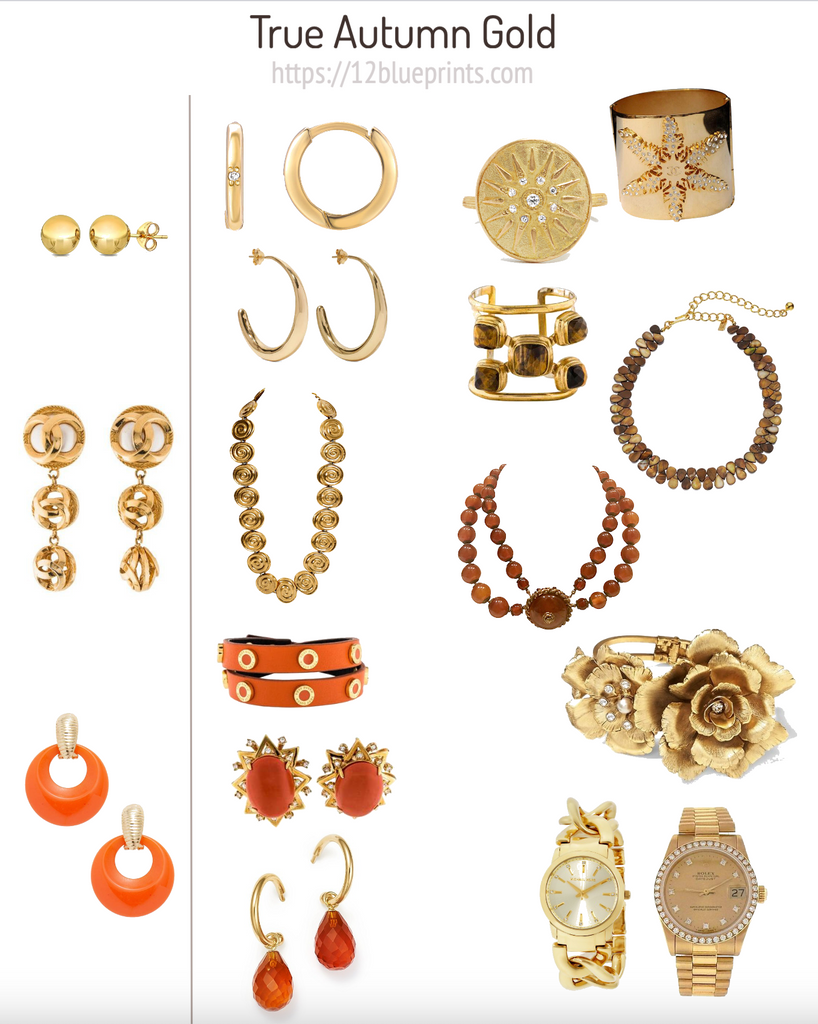
Do all golds work equally well for True Autumn?
Gold is a fundamental colour for Autumn, as yellow is for Spring, because these are the colours that provide the warmth for these warm Seasons and their Neutral Seasons. Like any other colour, gold has many variations and like any material, it has different types of reflectivity.
Shopping information: https://urstyle.fashion/styles/3623792
Autumn's colour dimensions are warm, soft, and dark, making those qualities ideal in the choice of gold. Gold that is very light, yellow, or shiny may step in front of the person wearing it. In this image, at the top right, the two hoop earrings are good versions of gold, not quite as yellow or as shiny as the sphere earrings to the left of the line. Of the two hoops, the lower pair seems more muted, more neutral, similar to the more and less colourful camel tones discussed earlier.
The second earrings to the left of the line may be fine because the gold is more orange or red than yellow, but they are very shiny. The answer is to lay them directly on the fully fanned-out palette and move them around, observing the interactions. If they outshine the palette colours, they may outshine the person. However, shine is expected in this item of apparel and the decision will be related to personal preference. The link necklace to the right of the line may be more comfortable or compatible, being darker, textured, and less shiny. The colour could slide into True Autumn palettes in a belonging way.
Third item to the left of the line, the clear orange may be a Spring variation from the colour brightness and the light shiny gold. The three items to the right of the line are better versions of True Autumn orange. The colour is darker, as is the choice of metal. Different styles, possibly for different people, but all good choices for True Autumn colouring.
At the top right of the image, we have variations of brighter and more neutral metals, either darker, less pigmented, or more textured relative to the super shiny items on the far left side. The ring might belong with the green golds in the palette and the textured metal softens the shine. The cuff is like a dark camel, similar idea to the hoop earrings.
Next are 3 items in which gold is combined with darker stones or natural materials, effects that look great for Autumn and combine well with metals. The rose is another example of a darker, softer gold, compared with the items on the far left. The three dimensional effect is more exaggerated, superb for showing Autumn colours (and people) in the best light.
If we compare the rose to the two watches in the lower right hand corner, the watch on the right has more continuity with the rose than bright yellow watch on the left side. The watch on the right is a great blend of light and dark rich gold, with nice use of diamonds around the face of the watch to heighten the sense of luxury without over-cooling the item or skin tone.