
In the last post, Bright Winter Makeup FAQs, we answered readers’ questions about finding their makeup look.
Today’s post looks at clothing, inspired by another terrific question from a Bright Winter reader.
Core basics that fit well are offered in black first. My investment pieces are all dark, with dark shoes. When I add a scarf to lighten and brighten and I can see that the overall look is too dark. When I add white, I feel like a True Winter. … How do I add the freshness I saw during the draping?
What Winters share
The quiet backgrounds and fewer colours of Winter keep the eye steady, reminding me of an installation, like you’d find in a museum. Whether shapes are symmetric or not, the use of colour feels a little too controlled to be organic. Like a stand of trees of the same height with parallel trunks, the scene wouldn’t quite happen by itself.
The stillness lends a sense of formality, an energy apart from the busy world where things are swooping, lifting, tingling, and spinning. The feeling of permanence sets in, relative to transitory. Movement is going somewhere else and feels brief. In stillness, time matters less. An impression emerges, that dressing like everyone else looks underdressed on Winters. They look more normal a little more dressed up, and scruffier when they wear everyone else’s casual.
I pinned current fall and winter coats to each Season’s Pinterest board, Bright Winter board here. You'll see vests and earrings too.
Of the 8 coats, 2 are black. You’ll see:
- a green that makes you look twice, a standout with every eye colour
- periwinkle, gorgeous framing the face with only a touch of yellow as accent
- a puffer coat in a metallic forest-avocado influenced dark gray,
- white, as gorgeous as black with more interest, (and no collar to rub the face)
- red with a hood, the sweetness of the fairy tale without being right inside it.
Have a look at the same items in the True Winter board, here.
How would you describe the differences to a friend? Moving the information from the seeing and feeling parts your brain to the language center will have more enduring value than any pages I could write.
If you wonder why certain colours are in their Boards, add the link for the Pin in the comments below along with your question. I’d be happy to answer.
The video below is here on YouTube.
The lightness of Bright Winter
Lightness through colour. The palette does that part with your commitment to finding the lightest version of every colour.
Lightness through shapes that say motion. Diagonal lines feel like movement, lift, and lightness. You could see them in stars, cones, triangles, zigzags, and glitter. True Winter feels more solid, with vertical lines and thicker lines, suggesting strength and power. Both are rigid, it’s cold out in Winter, more steel cables than ribbons, more tensile strength than floating horizontal waves. A line analyst who understands Seasons can adapt this for your body type.
Lightness of heart and mood. A little bit of magic, a shiny beetle, like you stepped out of a fairy tale.
Let’s talk about a basic Winter look, white top, black pants, below.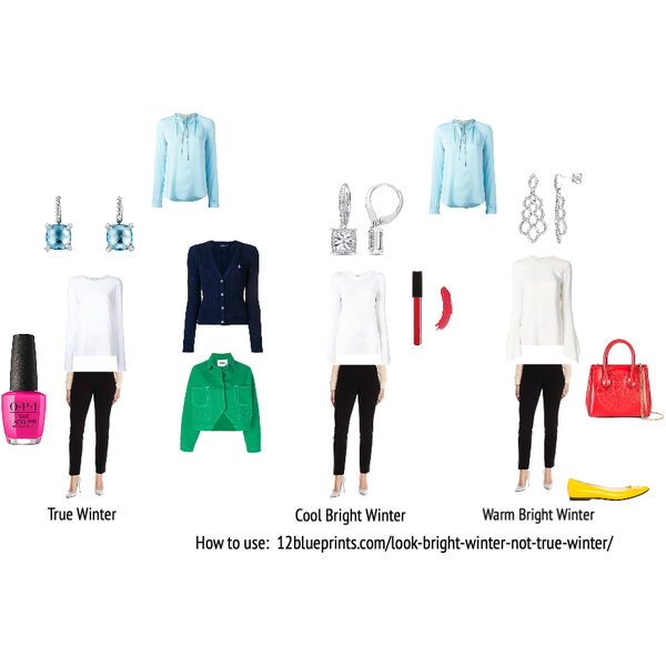
Item information: https://urstyle.fashion/styles/2728791
Notes on panel 1
The simplicity of the styles helps us look at colour with less distraction. The colours can be found in any shape, including yours.
Lighter overall look. The left side of the panel is darker overall than the right side.
The blue blouse at the top is our True Winter reference item. True Winter can look soft next to Bright Winter. Could you see the blue losing brightness or radiance on the right? It seems a little grayer and the blouse may look smaller. This is simultaneous contrast, what colour analysis is based on. The pictures and sizes are identical, but we don’t see them the same way because of the colours nearby.
Spring energy welcomes more colours together. True Winter’s use of colour is quieter; fewer colours say more. The navy cardigan and green jacket could serve either Bright or True Winter. I’d prefer the navy cardigan for True Winter outfit, depending on the woman and the occasion.
The nail polish is Bright Winter. For a small area away from the face, it shares enough with True Winter to be fine in my book. Delete it and the green jacket sits more easily in True Winter.
Stillness. No sense of flight: the earrings for True Winter.
Twinkling, triangles, livelier and more restless reflection of light: the earrings in the middle.
Space and lightness: the earrings for the Warm Bright Winter. Space gives lift and lets light in.
Warm and cool together, or warm associated colour (yellow shoes). The Cool and Warm Bright Winter would be good together. True Winter and Warm Bright Winter are less cooperative, by brightness (the purse steps in front of the reference item) and warmth (the purse looks orange next to the reference.)
Whichever neighbour Season you were closer to in your draping, meaning the one it took longer to eliminate, own that palette. Say it’s True Winter. The warmest colours of Bright Winter will appear bouncy and suddenly more orange next to a Bright Winter colour. The coolest fuchsias of True Winter will look blue to the point of being frozen instead of healthy and clear next to Bright Winter colour (see skirt in the next panel).
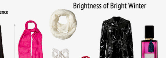
The brightness of BW
Item information: https://urstyle.fashion/styles/2762202
Shine. A shoe if not a jacket. The movement of light is busier and less predictable, less controllable in Spring.
Again about owning 2 palettes. Experts work with clear cut boundaries in physical form. Doctors don’t remember ranges for blood results, they look them up. Same with colours. In brightness, you’ll see that the pink scarf is more colour (more pigment, higher saturation) than True Winter. In warmth, you’ll see that the crinkle scarf is having nothing to do with the red strips of True Winter, but it shares something with the warm side of Bright Winter even if not exactly.
The pink top in the Reference column…notice that the pigment concentration is not as high as Bright Winter. Next to Bright Winter colours, True Winter can look soft. You might say, “That’s Summer isn’t it?" True Summer colour loses energy and Light Summer is too soft, without enough red or blue. The Bright Winter wearing this top will drop it to looking Summer-y. The top is on the softer, lighter side of True Winter, but surrounded by Summer colours, it would look a lot brighter. The ruffles are neither geometric, immobile, nor dramatic, all of which have many interpretations. If your True Winter colouring is softer and your body is curvy, it might be just fine. Wearing what you are looks normal and good.
Even with lipstick, Bright Winter can drop a bright colour to looking like a flesh tone. Sheer any colour you like but don’t choose softer colours. Without enough brightness, the lips look faded, which gives a tired face. Choose a transparent gloss with lots of pigment (the perfume bottle) or sheer a lipstick. Jorunn at Nordic Simplicity reminded me of MAC Relentless Red, which she uses as a stain, blots, and covers with gloss.
In the last post video, I mentioned looking at colour as bringing out more you. I try not to say things that have little meaning until you’ve seen them, although 12 BLUEPRINTS generally speaks to an audience that has had the PCA experience. (Folks new to personal colour analysis (PCA) may enjoy the conversation at Chrysalis Colour). Colour analyst and style coach, Anna Lazarska, recently posted an amazing series of herself in various Season colours, each with makeup for the Season. The post is One Woman, Four Versions. Have a look and think about, ‘Where is there more Anna?” Please keep in mind that the intention is only for you to see that they’re different. The lighting and camera settings are the same, therefore the software will average the lighting across each image to something other than your eyes would see in the same room. Anna is also our guest in the most recent podcast episode, here at Chrysalis. (If you'd like to see more One Woman, ... Versions, you'll find a compilation here at Chrysalis.)
The warmth of Bright Winter
Learning the warmth: Hide the cooler colour strips of the palette. Look only at the yellower grays, yellow and lime, warmest reds, green, and turquoise strips. For 20 seconds, let your eyes move around, placing your attention lightly. Now uncover the darker cooler blues. Did the jump surprise you? That’s the distance between the warm and cool sides, and the sound of Spring’s voice.
All Winters wear colours from True Winter. They share more than they differ. Add one Bright Winter colour and one Spring effect. Plenty. People get it. Especially on Winter.
Here's the panel again to minimize scrolling.
Item information: https://urstyle.fashion/styles/2762202
The warmth of the white. Anyone see Nicole Kidman’s outfit in Aquaman (YouTube trailer here)? I’d be looking for the T-shirt.
The crystal pleats of the polka dots. The sheen of the pink scarf heightens the reflectivity and feels brighter.
Use the warm colours as accents. Coral, emerald, bright lime, in sportswear, jewelry, purses.
Gold and rose gold. The earrings and perfume bottle wouldn’t work as well with the True Winter top. (OK, wouldn’t work at all).
Good humour and optimism. Spring is sweet. Spring will wink at you. The purple foil sandal.
Lift: the earrings are for women of different shapes, yet express lightness through colour and space.
Innovative and unexpected triangles, material, and design, in the cuff bracelet.
Repeat what you look like. Add points if they’re in your face. Snowflakes in a Nordic sweater work on small- or large-scale people. Add angelic motifs in they’re in your face, as the innocence of flowers, lace, swirls, starburst, or origami, depending on your lines and shapes.
Spring wears more colours together. If you were given the palette as a tray of paints and asked to paint some beautiful outfits or combinations, you wouldn’t paint Bright Winter as all colours any more than Soft Autumn as all butterscotch fudge, but you'd probably choose more than one colour with black beneath the colours in your head.
The Colour harmonies
The harmony combinations I see online can make for a heavy effect or they can feel right. Is it related to the light-medium-dark proportion?
They seem to me suggestions to use as you prefer. If 10 colour analysts in the same system gave out harmony suggestions, they’d all be different and all have value. I like these to see if the colours together work with a new colour I’m bringing in. Colours together is how others see us and our apparel. I ignore my taste, my reality, and think about, what’s true for everybody? Are the colour energies about equal? Is there a big step up or down from palette to garment (or cosmetic)? The runway should be about flat. Is the effect believable? Is the garment fading, sinking, or getting lost?
Colour-blocking can be a checkerboard or Picasso, tiny pixels or picnic tables. Play with the shape and size of the blocks. Have a line or style analysis, which actually does work online from a selection of photographs. Like reading X-rays, beware of conclusions from single images. In the Chrysalis group, visit the websites of Anna Lazarska (Poland), Cate Linden (Kentucky), Florentina Mossou (The Netherlands), or Rachel Nachmias (Philadelphia).
Vary the size of neutrals you wear each day. Spring enjoys change. As long as your colours and styles are consistent, you’ll look accepting and relaxed, rather than disorganized or searching.
Add one tiny piece of colour to each outfit.
Repeat a colour in a few places to connect the dots.
Think twice about hair colour (Podcast: Hair Colour for Winters here). Blonde is too much Spring and too much work unless it's your natural colour. The natural silver sparkles, the dark brown is purplish, the medium brown is like tea or rosy copper, why cover it with an opaque mask? It's not so rare to see Bright Winters with medium brown hair growing at the roots and naturally transitioning to a blonde of some type beyond the first 2-3 inches; a few highlights beginning from the brow or eye looks more natural.
Your colours are part of your story and part of your power. Colour analysis gives you creative control. Be like Spiderman, only shoot your web where you want to go.
--