
Your Season colour palette is a menu of colours that will look great with your natural colours. Matching the colours when you buy clothes or cosmetics is how to get started.
Because clothes and makeup come in hundreds of colours, using the palette in different ways helps get the most information from it.
In this post, we'll look at different ways of applying the palette to decide if colours are icy or pastel.

Image source: https://urstyle.fashion/styles/2969011
The top row, items 1-3, shows examples of pastels. These are further from white, and therefore darker.
The middle row, items 4-6, shows examples of icy colours. These are closer to white and lighter.
The top row colours are as light as Summer pastels get. Item 1 is a level lighter than Soft Summer's lightest colour, but has so much continuity with those colours that it could belong easily.
Icy colours also have some light-dark range depending on the palette and the person. If the colour is too light, the face may look powdery, bleached, or pale. The next level of the colour, meaning a step darker and more pigmented, might develop fuller colours in skin tones, eye, cheeks, and lips.
Asking our other senses for an opinion may be useful. I ask myself, "Does the colour feel frosty or watery?"
The Winter row is frosty, the Summer row is watery.
Item 4 is made of cotton, which gives a softer impression and reflectivity than synthetics, but this colour is frosty, close to white, and workable with a Winter group of colours.
The tuck shirt of item 6, works well for True or Bright Winter. Lipsticks from either palette could be worn without the shirt losing energy, with the choice of red depending on the person's preferences.
Item 7 is brighter than the top row, clearer you could say, or more pigmented, and also lighter. Take a moment to register that it's still quite far from white from pure white. With no frosty feeling, it might do well in Light or True Summer.
Item 8 is brighter yet, meaning more pigmented. It is not frosty though, has no sharp white about it, and might work well in the Light Summer to Light Spring groups.
Image source: https://urstyle.fashion/styles/2975223
Items 1 and 2 have very similar colours in the Winter palettes. One reason they belong is the visible red.
Item 3 is bluer, like a dusty blueberry, and grayer. It is True Summer lightest violet pastel. None of the Winter palettes would accept it with ease.
Item 1 has some gray, the softness of Dark Winter with its Autumn component. This colour may be darker than the version in your palette, but it shares similar tones. My ideal version would be a little lighter, clearer, and pinker than this, but overall, icy colours that are too white can make my skin look drained or fatigued.
Item 1 has a similar counterpart in Bright Spring, and although a version that's less gray would be great, the distance from pure white and extreme icy coolness in Bright Spring might allow some nice combinations. The colour has a similar version in Light Spring too, although darker than this.
Item 2 is clearer than Item 1, still near white and with that red content of Winter.
Icy doesn’t go darker than the 1-2 range and ideally a little lighter than 1.
Item 3 is bluer and grayer. The lightest reflections are soft, light gray rather than sharply white. 
Item 1 in the Violets group is darker and grayer than the perfect example. To show you a better version, just above are two tops of mine. The violet is lighter and clearer than Item 1 in Panel 2, and a better icy. The green is bluer and more pigmented than my palette version, but it's the same kind of colour, clear and light enough to be icy, and an example of an icy that gives me healthier skin tones than a near-white.
Image source: https://urstyle.fashion/styles/2975247
In the Summer colours on the left, the gray may be visible in the colour itself and in the folds, compared with the more pure pigments in the Winter colours. These are pastel tones. True and Soft Summer's versions would be darker and softer than these Light Summer versions.
In the Winter colours, you see visible white. They are too light and feel too frosty to slide into Summer palettes. The feeling is of snowflakes and peppermint candies, not lakes. These are examples icy colours and the light-dark range of icy colour in general.
Item 1 could slide into the strip of similar colours in Light Summer. It looks good with the lipsticks and neutral colours. Bright Spring has similar colours but the lipstick might be a bit strong; with a gloss or in certain combinations, it could be great.
Item 4 contains visible gray and could easily belong in the same world as Item 1.
Item 6 shows the warmth and brightness of Bright Winter. Next to the purity of Bright Winter colour, even True Winter in #5 looks softened. 
Image source: https://urstyle.fashion/styles/2975285
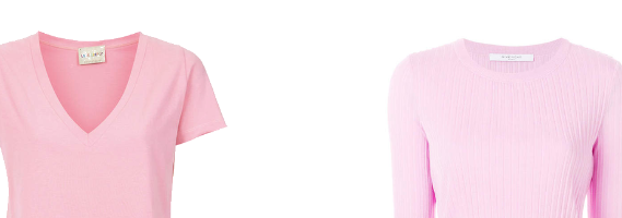
Can some colours be icy and pastel? In theory, probably no, but in function, yes, sometimes. The number of these colours is so low that there would be no point in making them into a Season, and even if we did, the palette would represent the colouring of very few people.
Item 1, the pink tailored top is pure enough in its pigment (clear enough, bright enough, synonymous terms in this context) and light enough to work for a Bright Winter, and also far enough from white and pigmented enough to work as a Light Summer pastel. It could work with either Season's lipsticks, depending on the colour and formulation.
Item 3 fit is an OK fit for both, although some might think neither. The Winter lipstick (or red swatch) is rather bright but at the same time, the blue seems frosty and contains too much white for Summer. In a real world situation, I would try the item with my palette in person before deciding.
We saw items 2 and 4 in Panel 3. If #2 were worn with the Summer red swatch as lipstick, the lips would look grayed and faded, exactly the same as in the comparison on your screen, and the blouse looks frozen.
If item 4 were worn with the Winter red as lipstick or a scarf, the T-shirt would appear tired and the lips or scarf too strong to wear with it.
How do you tell icy from pastel?
If you have ways of separating icy from pastel, we’d love to know about it. I am always very grateful for how much your questions and comments have moved our conversation forward.
--