
Pink is our topic today, so the lighter side of the red choices. We all have choices that we look great in in every colour family, and which ones they are come from our own natural colours, or Season, 12 groups.
You may be familiar with a colour wheel, how colours are organized around a circle. The colours we think of as warm, red, orange, yellow, on one side, and cool-associated colour on the other, blue, green, violet or purple. You could take any colour family, say green, and pretend you’re driving around the circle. You’d come in at warm green and leave in cool green as you head towards blue. Or come in at cool and leave at warm if you’re driving towards yellow. The order of the colours stays the same.

Photo by Ben Wicks on Unsplash
Picture you have 12 different colour wheels around a clock, each with its own warm-cool, light-dark, and bright-soft level that applies to every colour in that wheel. Each wheel is a Season. The idea is the same as the single colour wheel, you drive in on one side, drive out on the other, but the order doesn’t change. Green is always between yellow and blue, True Summer is always between Soft Summer and Light Summer.

As you drive along, colour properties change gradually. They doesn’t go warm -cool -warm – cool, and neither do they go warm-warm-warm-cool-cool-cool. As they change, colours progress through warm-neutral-cool-neutral-warm-neutral-cool. Like a single colour wheel, as you drive through green, it goes the order of colour goes warm green- neutral green-cool green.
In our Season Circle, we have two neutral warmth levels, warm-neutral and cool-neutral. The neutral colour wheels are for the Neutral Seasons, at 1, 2, 4, 5, 7, 8, 10, and 11 above, and their name starts with a word other than True. Most people belong in the Neutral Seasons, with colours that have both warm and cool choices and are not maximum about either as the True Seasons are.
As we move from one Season to the next, their colour wheels are also shifting in soft to bright and light to dark, meaning that all 3 colour sliders are moving as we drive around the circle.
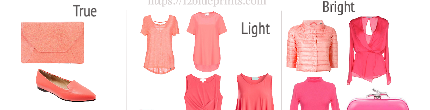
Pink for 12 Seasons
Our first image below will begin moving the pinks apart in your mind’s eye. The 2 warm groups, Spring and Autumn, and the 2 cool groups, Summer and Winter, are placed side by side to make the comparison easier.
When colours are closer together, we see their differences. When they’re further apart, we seem to see their similarities, which is why it’s quite important for hair and cosmetic and upper body colours to be in close harmony with our colours, whereas lower body and accessories are often fine when they work in the big picture, depending on how particular you are.
Pink is also a standard cheek and lip colour, another application to keep in mind for this family of colours, and most of those we see today are available in cosmetics you can see in the shop on my website.

Shopping information: https://urstyle.fashion/styles/3430913
In True Spring and True Autumn, colours are very influenced by Spring yellow or Autumn gold, giving pink a distinctive coral tone. Spring starts around middle brightness and goes up a ways, Autumn starts at middle brightness and goes down a ways. The bag and slippers are same colour family with similar brightness, with Autumn a little softer to begin, as in grayer or less pigmented, and Spring brighter.
In the boxes below, Light Spring and Soft Autumn, both became softer, with Soft Autumn more softer since it blends True Autumn with the also-soft True Summer, whereas Light Spring blends True Summer with the brighter True Spring. And with Summer in both boxes, they also cooled a little.
In the lower left boxes, Bright Spring and Dark Autumn began at True Spring and True Autumn and they also blended with a cooler group, Winter this time. They cooled, although still more Spring and Autumn than they are Winter, so they’re warm-neutral Seasons. Winter also brings brightness, with both items looking more pigmented than their True Spring and True Autumn starting places.
Back to the top on the right side, True Summer and True Winter are the people whose natural colours are cool, so we see bluer pinks. True Winter pink is cool like True Summer, and also bright. True Summer is softer, grayer, than True Winter. It may look warmer, as softer colour often does, and partly because the light colours stop at chalk in Summer rather than snow in Winter, meaning they retain a little pigment. White can come from yellow, the lightest colour in the spectrum, which is why a little yellow may be seen in True Summer white, with its source in their cool yellow.
The cool-neutral Seasons are in the 4 lower right boxes. Light Summer has a little of Spring's blossom quality, softened by Summer. This skirt is a woven material, making colour a little softer as well; it can almost seem Autumn, but it would look apart in the same wardrobe as the Autumn colours to the left. Soft Summer blends cool, soft Summer with a touch of warm, soft Autumn, moving the brightness slider towards the softer end. The pleated skirt is one of the cooler pinks and medium darkness among the Soft Summer reds.
On the far right under True Winter, Bright Winter is neutral-cool, compared with Bright Spring in the lower left corner, which is neutral-warm. Bright Winter colours are the clearest of all, blending Winter and Spring, both featuring brightness of colour, even compared w the other Winters. Dark Winter in the lower right corner is a cool-neutral group, like Bright Winter, and mixes with Autumn softness rather than Spring brightness. The shoes might be an example of their medium pink, with the earthy touch of Autumn relative to Bright Winter above, but less earthy than Dark Autumn. We have pink with density, more oil paint than blossom or petal, neither floaty or frosty.
Pink for 3 Summers

Shopping information: https://urstyle.fashion/styles/3431777
True Summer
In this cool Season, we have cooler pinks, meaning bluer, in a light to dark range. The pink sweatshirt at the top is the lightest pink. The violet T-shirt is in the darker range, and between these are several more darkness levels of pink.
The hat and shoe are excellent for the mixed fibers in the hat or the small print in the shoe, which make colours blur together a little, a great effect when steps between colours are small, like an impressionist painting with dappled light where each dab of colour is related but not the same.
Light Summer
The jacket shows the lightest pink and the jeans next step lighter or possibly lightest depending on your palette. These are variations of same colour family, both cool side of this Season, meaning the reds (and all the other colour families) also have a neutral and warm side to their choices.
As Summer, the steps between colours are smaller, partly because the light to dark range is small, like skipping stones in a pink pool where they touch down close together. On a Light Summer person, these pinks look different, related but not the same, an effect that builds a rich and abundant colour experience, how this type of light creates depth and texture.
Next, a carnation pink in the blouse, a bit brighter and darker, Light Summer being the brightest of the 3 Summers, and finally, soft raspberry sweats with sparkles at the pockets, more pigmented than the True Summer hat and not as blue.
Soft Summer
A neutral colouring type, so we expect warm, neutral, and cool pinks, of which there are many, with incredible flexibility in the looks they can create. In the top item, a neutral warmth, and then cooler in the blazer. These colours are warmer than True Summer, warmed with Autumn gold rather than Spring yellow, and softer than either True or Light Summer.
The soft rose crushed velvet or velour top, that particular textile is incredibly good for Soft Summer coloured people and the colour as well, as Summer's roses mix with a trace of Autumn depth and richness, expressed here in the slight texture of the fabric. The image evokes dried roses and the memories that go with them, how Autumn develops a vintage or heirloom flavour, with the same idea as cameos.
The shoe at the bottom is a cool soft pink, and Soft Summer will get a fair bit darker whereas Light Summer doesn’t get much darker than the sparkle sweats.
Pink for 3 Springs

Shopping information: https://urstyle.fashion/styles/3432778
True Spring
Mix clear yellow, like sunshine and daffodils, with red and pink becomes variations of melon and coral. Say, clear salmon pink. The earrings are light orange, pinker than citrus or orange marmalade. The dress is more cantaloupe, the zip neck sweater more coral, and the dress at the bottom is between the two.
None of these looks very bright, nowhere near the Bright Winter fuchsia top we saw in the first image, but place them next to the Soft Summer velour blouse we just saw and oh, boy, do they look bright. It’s all relative to what’s next to it or who’s wearing it. On a True Spring person, this is the perfect brightness in the same way the velour rose top is perfect brightness worn by a Soft Summer. It happens automatically, not by some self-adjusting magic at all, but simply the relative perception of how we see.
In True Spring the warmth slider is up at the high end, the brightness slider at med-hi, and the darkness slider hovers in the med-light to med-dark range, communicating the easygoing optimistic colour, the everything’s fine, don’t worry, attitude, and the sun still exists sensibility of Spring.
Light Spring
Here, Spring combines with a smaller fraction of Summer. Both bring lightness to the table, so colours can be quite light. An important takeaway for the Light Seasons may be that they don’t go beyond medium darkness. There may be a tendency to take Light in the Season name too literally or globally and apply it to the whole look every day, but I prefer when Light Spring combines several colours if they wear all over light choices especially, and wear their brighter colours, often their most glorious ones, and their darker colours. Ethereal taken too far can look fragile or flimsy, depending on the person of course, but everyone should look like a complete strong human being and our colours give us different ways of getting there.
This is the cooler side of Light Spring, so we see recognizable pink with a trace of apricot. The top and shorts might be Spring’s version of pastels (depending on your boundaries for pastel), since their Summer side gives them softness and coolness. The shorts, coat, and handbag move around a bit more, from lighter to darker and cooler to warmer.
Bright Spring
Spring a lot, Winter a little. These are choices from the cool and neutral sides, with warmer reds in this palette too.
The jacket at the top includes cooler and lighter pinks woven together. Why did I put it here rather than Bright Winter? When I pictured it worn with pure white, which is easy for Bright Winter but stark for Bright Spring, compared with clear ivory, the ivory felt better. We’d have to try in person to know for sure, but I also saw plenty of lip colour choices in Bright Spring whereas Bright Winter cosmetic colours were too cool viewed next to this jacket, dark or severe. Lipstick is worn in the same visual field as upper body clothing and appearance improves when the two are harmoniously coloured.
The crochet dress, seems softer than the other items in this group, could it be Light Summer? It's easy enough to confuse the two Seasons, especially in the lighter, cooler colours. I chose Bright Spring because here’s what I did: I found the best matching colour in the palette and ran the strip under the dress to see what happened with the other colours in the strip. Light Summer's lighter colours faded and became hard to see. The darker colours stayed about the same, but darkness was compensating, which isn’t the goal.
If colours need to be dark to be visible, we may be looking for another Season. Bright Spring colours held their own, neither they nor the dress changed as the strip moved up or down. You probably have just the one palette for your Season as most people do, but try it all the same, moving the strip next to the clothing colour, looking for both clothing and each swatch in that palette strip to stay about the same. This could be one of Bright Spring's lighter choices or Light Summer's deeper ones, meaning it could function in both places.
Pink for 3 Winters

Shopping information: https://urstyle.fashion/styles/3434028
True Winter
The jeans are light, cool, and clear. We wouldn’t call this dusty pink and they do have a frozen quality. Winters also have icy pinks that we’ll look at in our second visit with Winter, whereas the jeans are a light pink from the regular red options.
The skirt appears yellower, but the Seasons are a journey round a clock and this may be slightly yellower, a tiny slice through the True Winter red experience. We also know that the Seasons are about 3 things always: warm-cool, light-dark, and also soft-bright. The skirt is either cooler or softer or both compared with the items in Bright Winter.
The bags show a more violet option above and more red below. The lower bag, with the yellow metals would be quite suitable for Bright Winter too, maybe their softer side when we drive in from True Winter. The warm metal is small enough to be fine for either, but I prefer the look of silver and black with this Season like in the top bag, for being better defined within the pink, giving a cleaner effect. Gold earrings and rings worn by True Winter colouring create the same effect, of yellow metals being hard to see, appearing duller or tarnished or dark, whereas silver refreshes the look of both jewelry and person.
Bright Winter
Mostly Winter, some Spring. Textiles vary easily from sheer and silky to T-shirt to Lycra and cotton. With colour this bright, we wouldn’t wear many at once, choosing instead to combine colour with fashion neutrals colours such as black or navy to give the eye balance. A place for stillness or silence, which may be the musical analogy, is more appealing than continuous signal, which eventually feels like noise and loses meaning.
We’re driving around a clock, leaving True Winter and entering at the cool side of Bright Winter with the top two items, and we’ll exit on the warmer side of Bright Winter. These items are not neon, although the top blouse may be synthetic, like a highlighter marker colour, and yet serves as an easy natural blush for this person.
The bathing suit top shows a darker pink, in a textile that saturates well and holds brightness under the sun. The darker pink since is useful for Winter, where darkness is a property of this colouring and in how we wear bathing suits, we don’t always have the option of adding darkness to balance the overall look with the person, meaning that how we wear or position things may influence the colour we choose.
The skirt is moving into coral, with enough red and saturation to belong with Winter.
Dark Winter
This colouring combines a bit of Autumn’s rustic type of natural with Winter's more synthetic jewel tones to colour a person that combines dark olive, smoked ruby, and sapphire blue.
The bag is a cooler pink, warmer than the cool pink bag over in True Winter. Dark Winter is the softest of the 3 Winters and here, we have texture to soften the colour a touch. The hardware has an Autumn vintage feel, or maybe industrial or functional, both Autumn impressions.
The skirt is a heavy rose in a colour with more density than petal pink.
The backpack is a darker rose for this darker Winter, like roses in the shade, with dark gold hardware raising the Autumn presence.
The shoes at the bottom show warmer and cooler pinks together, with a coral braid that suggests Autumn texture and strength, like a rope, and the cooler pink in the shoe, smooth and shiny without being patent.
Pink for 3 Autumns

Shopping information: https://urstyle.fashion/styles/3433177
True Autumn
We perceive pink or red in the blush, rather than straight up orange, like pumpkin, and nor is it gold; it’s both. The shorts are made of a terrific Autumn textile in a Santa Fe red or Grand Canyon sunset colour.
The bathing suit is similar to the blush or a bit brighter, and you could do great things with a cover up, sandals, gold and gemstones. Autumns can decorate like there's no tomorrow, no need to limit the combinations as long as they stay in palette.
The blouse is moving closer to orange, with warmth that gives the colour a brightness, with less red compared with Dark Autumn. Darkness is an Autumn colour property and reds become quite a lot darker than this, which they didn’t in Spring.
Soft Autumn
A warm-neutral colour group so pink has golden warmth, these from the cooler side of the reds, from light powdery peach at the top to soft coral pink.
The sandals are interesting as a pinker version, say, clay pink. Depending on your palette, a colour like this might appear in Soft Autumn's regular palette or the corporate or additional palettes. The pink might suggest Soft Summer, but it’s a touch earthy for that group in that the colour might look heavy next to the water energies of the Summer groups. Clay and putty are Autumn colour effects, with the suede contributing to the muted quality of the colour.
The bow ties are soft light coral, which I see closer to brick than blossom.
At the bottom, a gorgeous soft terracotta blouse, as easy a colour as Soft Autumn could have, and could serve as a wardrobe neutral if reds could be have that role.
Dark Autumn
Warm-neutral again, with Winter mixed in.
About the skirt at the top: once Winter arrives, the light to dark extremes move further apart, Winter being the ultimate white to black group. The 3 Winters have the icy colours as their lightest colour choices, very near white and frosty clear. From the map at the top, Dark Autumn and Bright Spring have some Winter influence but are too far away for frosty or icy. However, both have a selection of very light colours. This skirt is the spiced peach from that group.
The next top with the balloon sleeves, I considered Spring. It's not bright enough to work with Bright Spring's other colours, so I dropped down a Season in brightness to True Spring with a good result. When I tried making outfits with the top and the green choices, Dark Autumn greens felt calmer to make outfits compared with True Spring. The compatibility is high though and this might be a good compromise colour for Dark Autumns that want bright colour choices.
The gloves are easy as can be, with the Dark Autumn colours in the, wrist ruffles and the pink is perfect with them. When the colours talk with the other colours, you’re on the right track.
The dress is a rich warm paprika colour, only medium darkness level in Dark Autumn's light to dark range, which gets a lot darker, as we will see.
More Pink for 3 Summers

Shopping information: https://urstyle.fashion/styles/3436985
True Summer
The lace skirt is a soft fuchsia. True Summer and True Winter share coolness, would True Winter wear this? Possibly, they share a lot and a few colours exist that could work for both, but I see the Winter version better in the blazer, a bluer, clearer colour, that might look aggressive on a True Summer and the skirt might look softer, grayer than it is on a True Winter.
The wallet is another example of a fuchsia pink that could work for either True cool group, with more latitude because it’s a small item seen at the end of our arm. It's brighter than the rest of this group but it doesn’t stand out. The shoe, which we saw it in the first Summer panel, is a softer fuchsia still that could be one of their cool pastel warmer pinks.
The wrap sweater: if we were driving out of True Summer towards Light Summer, this could be a nice pastel coral, soft enough for True Summer and cooler than the other Light Summer items here.
The sunglasses with the great blue violet lens and green frame would work for Soft Summer too. They show the use of colour gradients that’s so becoming for Summers.
In the lower left corner, the shorts with the ? in a very blued pink show a colour that can be found in textile, like neon, but it may be too blue to be altogether natural. However, True Summer can make sense of this colour because blue violet is so easy for this colouring. Plus, shorts are not viewed next to the face, though the colour might be very blue as a blush. The Tshirt above the shorts is closer to my idea of True Summer’s cooler red.
A soft raisin in the cardigan, dark pink, like the Soft Summer fringe purse but more pigmented. The colour is too pink to be burgundy, it's more like dark soft raspberry. This is getting to be the darkness ceiling for True Summer.
Light Summer
In this second time through Light Summer, we look at the warmer reds. The purse appears made of lipgloss, with a watery aesthetic, like a summer drink, with similar lightness and translucency. Compare it with the pigment density of the tiny red bag at the bottom above the red sneaker. There’s a quiet kind of brightness in this Summer Season.
Sheer plays into these colours perfectly, which includes coloured glass, in the sunglasses with the rose gold frame, featuring gradients made of different colours, at once Summer's love of gradients and Spring revving up the colour variety.
The belt to the right of the glasses is from the warmer side compared with the more neutral warmth in the earrings below. The silver metal is gorgeous in this neutral to cool Season, as are rose gold in the eyeglass frames or small diamond details in the earrings. The earrings combine various pinks to look like coloured glass with a little Popsicle aesthetic. Fruit syrups swirling in water remind me of Light Summer.
The sheer blouse has a a gorgeous print with a floaty feel in the sleeves and a more opaque carnation pink in the cami. We see an even warmer carnation pink dress for Summer where monochromatic outfits are beautiful, and why not a pink dress? Gorgeous as blush and lipgloss as well.
When is red is too red and belongs with Winter? The running shoe looks like an excellent contender for a Light Summer red option. It's easy enough to picture in this collection, and we see it in the same size or larger than the other items, which isn’t the proportion a shoe would have in everyday appearance. Compare it with the tiny purse, probably Bright Winter and the shoe seems a bit duller (and might be True Winter red, but shares enough with Light Summer). The tiny purse with the ? is more red than the shoe is red, and may belong with Bright Winter.
Soft Summer
We have a version of red, white, and black in the cardigan, more colour block than gradients. Soft colours can be combined any way you like, with their softness giving them incredible versatility. A soft cool pink at the top, more golden than True Summer pinks, next to a soft white band at the waist, and finally soft charcoal in the lower section, as a version of black for this darker Summer, where black would not be darker or more intensely black.
Soft Summer has a warm side too, in the bucket hat, with the excellent glasses beneath. Add sheer lips in the lens colour, too good for words.
The earrings are made of black lace and roses with the cool dark pink stone, and Autumn bringing darkness. Autumn light also affects shape, giving objects a 3D effect, as we see in the roses, still with exquisite delicate touch of Summer.
Next down on the right, the fringe purse above, lighter pink bag below, and the skirt to their left, showing a cool-neutral-warm range for Soft Summer. The skirt is warm and does have golden tones, it may be on the Soft Summer - Soft Autumn divide, but it may be a better blush for Soft Summer due to more pink tones.
At the bottom, the denim jacket and sweater with the ? There are many items in stores that are as light as the sweater and very dusty or soft, with very little pigment. I wonder who would wear this colour and look great. It's too light for Summer pastels, the person might look washed out. It's too soft for a Winter or Spring colour, now the sweater would look washed out. It's too pink to be a wardrobe neutral. Like those blue violet shorts at the bottom of True Summer, if anyone’s going to wear it this sweater, it will be Soft Summer, having enough in common with their colours. Beneath the face, I prefer the denim jacket for the amount of pigment.
More Pink for 3 Springs

Shopping information: https://urstyle.fashion/styles/3440429
True Spring
Coral is Spring's pink, along with peach. It doesn’t always come across in the palettes and colours can appear much the same or just one colour getting darker. The warmth throughout the palette, smaller light to dark range of True and Light Spring, and the medium softness result in reds that don’t seem to vary much. In addition, a 1” swatch doesn’t show nuance of colours as well as larger areas and surfaces.
At the top, a peachy sand that might be founds with the fashion neutrals or lightest orange, depending on your palette layout. The shoe is orange and here as a warmth and brightness calibration, meaning that nothing we add should step too far outside a plausible world with that shoe in it, a garden with that flower.
A typical impression of True Spring coral (brighter side) might be the long knit long skirt, repeating one of the colours reflected in the shoe. The colour qualifies as pink if the comparison is orange.
To the right of the skirt, the wallet, this is the lightest coral, also softer than the skirt. The earrings below, are gorgeous medley or yellow, coral, and orange, beautiful in this smooth surface, with the glow that this blush would create in skin. The colour is warm but not intense.
In the bottom row, we see another coral in the tank top and a melon coloured T-shirt with gold sparkles. True Spring wears glow and shine well, and keeping metals and stones from looking hard is easy when colour is warm and size small, like the earring or the buttons in the trench.
The trench is pinker, with shine that gives it warmth as light reflects and lightens the colour, Spring hallmarks. This coat could belong with any of these groups, 88% gorgeous being the same as all the way gorgeous. A sheer lip in this colour for Lights, bit warmer for Trues, called makin' it work.
Light Spring
Calibration items are at the top, from the lighter side of the pinks, warmer on the left and neutral on the right (the cooler light pinks are shown in the first Spring panel above). This colouring type is less pigmented than True Spring, and a neutral Season so the warm and cool range is wider, meaning pink and orange can move further apart and look more recognizable as traditional pink and orange.
The dress is a light coral in a soft or matte textile, with visible yellow in the colour, without the depth or weight of gold. The fringe top to the right is here because Light Spring is a muted Spring and may have crossover colours with Autumn, another muted warm group. How about True Autumn for this top? The turmeric yellows were odd, a reminder to try the colour with others in the palette besides the one that looks like the match. How about True Spring? The greens looked almost neon, too bright to make balanced outfits. Light Spring feels comfortable.
Next row, we have the cami and jeans in blossom pinks, a step brighter in the jeans. In the lower row, the reds for Light Spring might qualify as pink in this light Season where no colour gets very dark, so the reds are still in the realm of pink. The Halter neck blouse and headband, are lollipop colours rather than Valentine’s or foil reds. The lightweight fabric with sheen are the transparency of the petals in the headband are examples of textile and colour working together.
Bright Spring
Winter influence is here and icy type colours exist, though not as white as in Winter. These colours are quite light and very clear, with no visible gray in the puffer jacket. I had trouble imagining what to look for in clothing so I asked myself, “What would a candy in this colour look like?” , Bright Spring having candy properties. Try picturing a colour in a world that the Season evokes, as we've mentioned with Santa Fe for Autumn and summertime drinks for Light Summer.
The fuchsia blouse at the top right is one of the neutral warmth choices. Transparency and lightness of weight give lift in a textile that holds dye well and layers beautifully without becoming heavy.
Next row, a neutral to cool progression in a coral pink turtleneck to light cool fuchsia pink purse. There’s warmth in this fuchsia purse, it doesn’t look frozen but does have enough coolness that the silver clasp looks clean and good, even better for being shiny, like an icicle for a clasp, very fairy tale effect. Picture it over in True Spring, it wouldn’t quite work as well, would look hard or apart, with a similar effect worn as jewelry by a person of this colouring.
Next row, a fisherman knit sweater and office jacket in bright pink and coral. Colours are becoming brighter and darker, when will they tip into Bright Winter? We have a Bright Winter calibration in the fuchsia sweater with the ? at the bottom, and it does look cool and dark next to the Bright Spring items, even their cooler pinks.
Just above the Bright Winter sweater, we have a coral pink purse and a cooler pink in the right side purse, with bits of black, no large areas of it, and shiny gold metals to add warmth. Once again, the Bright Winter sweater is too blue to settle easily into this world.
More Pink for 3 Winters

Shopping information: https://urstyle.fashion/styles/3438290
True Winter
Icy colours across the top for these 3 Winters. A question might be, “Icy means very light and very clear. So how light and clear are we talking?" These items are not white but close and would be comfortable with white or black in a print. Icy colour would stay the same whereas pastels might appear grayer. The coat has more pigment and balances the black button, meaning it’s too clear and light to be pastel.
Of the sweatshirts, we saw the one with the ? back in True Summer. It shares enough with True Winter to get along well here , coolness being most important, but it may lose presence with the darker items at the bottom, whereas the pinker sweater to the left would keep its energy.
The hats, same idea. The lighter one could be fine with True Summer, it’s cool and light, so True Summer is happy. True Summer has similar colours to the darker hat although less bright or pigmented. This berry may be on the soft side for True Winter but it would find much in common with the palette colours and would make a fantastic lipgloss, resembling So Regal in the True Winter colours in the shop on this website.
Sometimes people look at their palette and express doubt about their colours. In some way, they’re saying “I can’t picture myself wearing them.” Maybe they have a preconception from images they’ve seen, such as Winter is stark and dramatic. One thing at a time. This hat isn’t stark or dramatic. It’s just a warm hat. Same situation with Summer colours looking gray, and as all these panels have illustrated, next to your colours, they balance out to be perfect brightness, not in front of you or behind.
The purses show darker fuchsias and both are great colours. The gold in the purse with the ? feels a touch awkward for me. If it were writing, it would be hard to read or you’d have to keep looking away or adjusting your angle, with the gold and fuchsia seeming to push one another apart. The silver is so clean by comparison, easy to read, crisp, and even the chain is defined.
Bright Winter
The cooler icy pink has more pigment than True Winter and is very light. As a Neutral Season, a warmer icy version exists, as the pink peach sandals. The top with the ? on the Bright Winter-Dark Winter line: We could ask, is there such a thing as too light to be icy? As with Summer colours that are softer and lighter than the palettes, it may depend on who’s wearing the colour, where or how is it worn, and whose opinion is being offered. I could slide it into any of these Seasons, even True Winter, and feel comfortable.
The coat and tiered camisole are cooler, darker examples of how pure this pigment is, where even True Winter colour looks soft by comparison.
Next row, the neon shoe, why not in a small item, it is lighting in a bottle but for a purse or shoe, sure. The jean jacket in bright coral, shows us a warmer pink in an unusual application, which comes easily to Winter since colours are a little synthetic to begin with.
The purses show bright fuchsia, like Dark Winter with more pigment, and the cooler fuchsia crossbody where we see the superb relationship between these colours and small but committed use of black.
Dark Winter
The pleated shorts may be too light for some and fine for others, I belong in this group and too bleached can be draining to my skin tone, probably better in the T-shirt, meaning icy colour has some latitude.
Next row, we have two pink skirts, cooler on the left and warmer in the coral belted skirt. The cooler pink might not be in a palette but to my logical mind, it made sense. Each Season has a thousand colours, but we need a palette we can carry around, so they’re a curated menu to help us find all those other colours. Corduroy in the belted skirt lends itself well to Autumn effect, here as a way of showing the earthy side of bright pink.
In the next row, the printed skirt is an example of an Eastern or Chinese painting on silk style, in warm rose with a tiger for Autumn, and sapphire, true red, and bits of white for Winter. A reader might think, "I’m a Bright Winter and I’d wear that items." To which I'd reply, "Absolutely!! Change out the top you pair it with and it would grand." It’s common that prints are very good for a couple of Seasons, although not perfect for any, with many ways to make them work. The scarf is a rich rose colour, with a print that includes olive green, white, turquoise, and small areas of soft colour which Dark Winter can figure out, being a little soft already.
The earrings. Dark Winter has a selection of violet fuchsias that might be with the purples in your palette rather than the reds, shown here in the darker version in the lower square shape, a bit mulberry actually in shiny embroidery thread to give a jewel quality. The rose gold in the square above has a lot of red, redder than Autumn chili or rust, an interesting dark rose gold. The red connecting beads look like Smarties or jellybeans and belong in the design for a Winter, with better acceptance of synthetic or plastic effects than Autumn might have. The disc at the top is has warm metallic colours in a textured surface, like rows in a ploughed field.
For the bags, Winter goes to a dark endpoint so pink becomes dark. We see dark pink suede with a great lighter strap colour on the left and in the lower right corner, rich pomegranate with a muted blue violet inset at one corner and a brown leather strap with mustard stitching, Winter plus Autumn.
More Pink for 3 Autumns

Shopping information: https://urstyle.fashion/styles/3442455
True Autumn
The light orange in the bag is one of the lighter reds. The sparkly bracelets are soft sandy peach pinks that you might found with your palette reds or in the fashion neutrals section of your palette, a gorgeous pink parchment colour.
The two bags below are versions of soft coral pinks, like Mediterranean clay roof tiles in the late afternoon sun, the lower one pinker and darker. The body suit is a colour that True Spring could potentially wear, like the balloon sleeve top in the first Autumn image. Some colours, they wouldn’t share at all, but this is one they could.
To the right, the mocha rose racerback top on the True Autumn-Soft Autumn divide is an earthy rose that could be fine for either Season. As makeup, it might be more noticeable on a Soft Autumn, where True Autumn might needs more pigment and darkness to be effective, depending on the item.
Autumn reaches a darker endpoint than Spring, here in the ruffle top as one of the darker bronzed reds, a burnt sienna colour, also found in the great bracelet with the so-yellow-it’s-orange sun motif. The suede bag is a deep coppered rose in a textile that enriches the colour and gives it depth, also a superb blush colour since light or candy colours in cosmetics are less effective.
For the sports bra at the bottom with the ?, although True Autumn could wear it fine, if you hold up the wardrobe neutrals next to it, beiges and so on, the top looks suddenly brighter. Hold up True Spring neutrals and the top stays the same.
Soft Autumn
Colours in this group may be quite light and powder, though not blossom or baby pink. This is a warm glowing pink, say adobe pink. The purse is a gorgeous soft pink with yellow and cool pinks blended throughout, a woven textile that looks like a beach, with the perfect clasp in light brushed rose gold. The bag to the right is the lightest of the cool-side pinks, a soft warm powder pink.
The shoe below is an example of mocha rose, a terrific cheek and lip colour that finds you where you are and enhances your features a touch more without adding noticeable cosmetic impact. The spiced orange bag next to the shoe has more warmth and darkness without being extreme in either dimension.
The shorts are like the racerback tank top but softer, since much that describes Soft Autumn is True Autumn softened. Both pairs of pants show a perfect textile in soft rust and brick colours, in a floral and a linear print.
The cardigan on the True Autumn-Soft Autumn divide is as warm and bright as Soft Autumn might wear, tipping over into True Autumn as well.
In the bottom row, the deeper pink red in the dress is a softer True Autumn (and cooler and lighter), resulting in a gorgeous soft warm Marsala pink.
The baby outfit is warm pink brick, cutest thing ever. Because sometimes you see little children and you just know their colouring and it may be quite rare to find this colour in children clothes.
Dark Autumn
The jacket is an example of Dark Autumn's lightest colours, in the same way that Bright Spring had the shiny peach puffer jacket. This is spiced salmon, shiny like the puffer so it’s reflective like ice, here darker, more muted, and not as cool.
The coral purse resembles a colour found in True Autumn, with more pigment. It might be among the lightest of the Dark Autumn pinks except for the bomber jacket. The smock top is more intense, with a burnt quality, scorched as Winter brings more red, blue, black. Even the yellow is stronger, more saturated, though this Season is cooler than True Autumn.
The coat is warm and earthy, yet bright at the same time, in pink, orange, and brass yellow in a tapestry textile, giving an impression of being woven with pure gold. The earrings combine bright tortoiseshell in black and yellow that might be contrasting or distracting from the person wearing them in the other Autumn groups. The coral is balanced and at home.
The shoes are examples of darker reds that True Autumn could easily wear. The metallic sandal is warmer and more pigmented than True Autumn, burnished orange and among the lightest of the warm reds. This would be a good option for cheek highlight, being in the function of that product to be lighter, whereas I much prefer a deeper lip colour for looking more natural and balanced than the lighter coral purse, for example.
Dark Winter had violet fuchsia and dark berry purple. Dark Autumn has black orchid, also in a light to dark range. The folded rose at the top may be in a colour similar to what you might find in Summer, but this is warmer and more pigmented. Despite the flower shape, the impression is more leathery than watery. The raisin velour hoodie is redder and the earrings bluer, both beautiful for the neutral warmth of Dark Autumn, and could be great in outfits with the softer, Autumn side of Dark Winter as well.
Web Store Interruption Upcoming
A possible Relocation coming up from March to July 2023. Shipping most items will continue although inventory may not be replaced until June or July of 2023.
Cosmetic Sample Sets will be unavailable after March 25 and Fabric Sets will no longer ship once current stock is sold out, with both will returning in the same June-July 2023 time frame.