
Purple today, how to choose yours. Colour has creative side and a technical side. Today’s post is on the technical side, where we’ll see colour charts come to life in all kinds of apparel and accessories, in variations of the purples that flatter each type of natural colouring, or Season. There are 12 groups.
The technical side gives us a framework to work within. If you’ve had a Personal Colour Analysis (PCA) and have a palette that includes different purples, look for what they all have in common. Be relaxed in your creativity as you paint the picture of you with the things you wear, or complete the picture of you, since our own colours have huge influence in how our clothes, makeup, and hair colour will look.
Colour analysis solves the question of, "I have this jacket that looks amazing on my friend and it's nowhere on me. And I'd like to know why so I can look like the best version of Me."
The video is also available here on YouTube.
Purple 1: Red and Blue Violet
We saw some red violets among the darker pinks in our recent Your Best Pink blog post and video. Today’s colours pick up where some of those left off. We’ll see redder or bluer purples in a light to dark range for each Season.
In this video series of Your Best.., we’ve seen that for each colour, there’s a new challenge. The traditional version of a certain colour might not appear in some Seasons, Summers and orange, for example, or a colour might look different from traditional versions of the colour, like Autumn navy blue was greener and looked teal.

Shopping information: https://urstyle.fashion/styles/3481661
Purple 2: 4 Seasons
With purple, I'm not always certain of warm and cool. Red is more intuitive; bluer is cooler, yellower is warmer.
What about when the colour is blue or purple to begin with? Warm blue, or blue that is harmonious with warmer palettes, is redder (I think of a fireplace). Cool blues may be greener, but we find both redder and greener blues in all 12 palettes. I have 2 solutions.
Rather than warm-cool, I use brightness, which can be a good exercise in not over-prioritizing warm and cool. Light to dark can be helpful, but unless it’s extreme, like icy or near black, its usefulness varies for knowing Season.
4 Season purples with similar darkness are shown below. If we think of brightness, meaning how much pigment is present and how much gray, the comparison is helpful. Spring is brighter than Autumn with more pigment and less gray, yet both are warm. Summer is softer than Winter and both are cool.

Shopping information: https://urstyle.fashion/styles/3482267
NDU Colors Palettes
The second helpful advice is bring your colours with you. Store lighintg isn’t ideal, but a comparison gives a general sense of whether to consider the item further. The Color Cards below fit into the back of a phone case. At the same site, you'll find mini fan-style palettes that include all the colours, as well as various other product formats.

Shopping information: https://nducolors.com
Purple 3: 3 Winters
Seasons are in order of soft to bright, from L to R. In the three Winters below, we see Dark Winter > True Winter > Bright Winter. True Winter is brighter than Dark Winter (more pigment, less gray) and Bright Winter is brighter again.
True Winter is coolest. Dark and Bright Winter have the same warmth level, both cool-neutral types of colouring. Brightness makes them different.
Dark Winter
We have a selection of bluer and redder purples with the purse and gloves about as light as purple would be. The items in the column have similar brightness.
The textiles, including cotton, ribbed knit, leather, and wool, have slight texture which softens the colour, a good effect for this softer Winter. The dark metals in the strap and clasp of the purse are attractive with Dark Winter skin tones.
True Winter
We see a midnight quality replacing the slight smoke of Dark Winter. The cami or slip at the top left is a beautiful colour for this colouring, one they wear uniquely well.
The envelope purse is blue enough the work in True Winter, and in Dark Winter with suede softening the colour. The item settles in with the others in this column and adds to the picture.
Red purple sweater, a great colour for TW. The leather jacket, could fit into any of the three groups. It is dark enough to make nice contrasts, which looks great on Winters, and an interesting alternative to black.
Bright Winter
With more pigment, the crayon or synthetic property appears, less or more depending on the colour and textile. Most of these are bluer purples, bright periwinkle, a phenomenal group of colours for Bright Winter people. The red purple plastic case overlaps into the warmer Bright Spring, whereas the long sleeve T is bluer and better in Winter.
Colours can be very bright in this Season, like the sleeved dress at the bottom, or a little softer, like the sleeveless. We often see a brightness extreme in fabrics and cosmetics, like the near-fluorescent quality of the sleeved dress. Bright Winter wears it with more ease than the other groups, but most people won’t choose it on a daily basis, or ever, and there’s no need to. If the long sleeved dress were removed, the sleeveless dress might appear brighter and be more comfortable for more people and occasions.

Shopping information: https://urstyle.fashion/styles/3486081
Purple 4: Winter or ?
Imagine that you’re a Winter, going through your closet deciding what to keep. A few items are great and some you’re not so sure. The charts and palettes are essential as a reference point. The next step involves comparing.
The two items at the top L with the empty space in between are calibration items, a reset for how they look together before we challenge them. They show each other to good advantage, without either being altered by the other. Next, we'll insert items from our Not So Sure stack and see if the same effect is maintained, of nothing altered, faded, odd, or un-belonging.
L side, 2nd row: Not only does the centre item seem good for Winter, those on either side might look at little more colourful, perhaps a slight improvement from the top row. The three items seem to be cooperating and maintaining vibrancy.
L side, 3rd row: The top tier of the earring is a similar blue-violet to blouse above but softer. The three purples hold their own between the items on the sides, not getting grayer or sinking backwards, and their darkness may help. This seems a good Winter item.
L side, 4th row: By brightness alone, the wrap skirt suits Winter. The colour jumps forward and looks bright compared with the two on the sides.
R side, top row: The sheer ruffle top in the centre is dark but dark colours can be soft and not Winter. Might it be a darker Summer colour? Summer would love the coolness, and the sheerness. The ? means that we need more information, meaning trying it with Summer colours before deciding.
R side, 2nd row: A ? again. My first impression is that the purple looks heavy. Perhaps for Dark Winter? I'm unable to picture this item with Dark Winter ruby or black olive so it would join the last item on the Maybe shelf. If you asked if there are colours that don’t fit in any Season, my answer would be Yes, from neither technical or creative side and they're most often purple or green.
R side, 3rd row: The woven purse looks Winter because we can read across the row and the colours are on the same line in the same font, as if they were words.
R side, 4th row: The boot looks rather happy, possibly from the style or fabric? The colours seem good for Winter and easier to imagine than with Spring, Summer, or Autumn.

Shopping information: https://urstyle.fashion/styles/3486098
Purple 5: 3 Autumns
Autumn is a warm and soft type of colouring with fewer choices in purples, offset by many golds and oranges, the opposite of the cool Seasons.
Below, from L to R in soft to bright order, we have Soft > True > Dark Autumn.
There's a Soft Summer visual in the lower L corner and a True Winter visual in the lower R corner. The Seasons in colour analysis are like the Seasons in Nature, they change around a cycle, following a certain order, and these visuals give us a sense of where we've been and where we're going.
Soft Autumn
The sock is as light as purples would be. This colouring is a blend of Summer and Autumn, more Autumn, and a warmer version of Summer's traditional pastels is here.
The bag is next, bluer than the bracelet. The weave in the bag and the tassel on the bracelet are great Autumn details. Both are a bit brighter than the Soft Summer coat in the lower corner, or maybe just warmer, which can look like brightness.
Two darker bags are next, great for building outfits as Autumn welcomes some darkness in the overall look. The top bag is bluer, the lower bag is redder, and both are softer than the colours in the True Autumn column to the R. The lower bag is about as dark as Soft Autumn purple gets and is a great example of a colour that’s very soft and dark at the same time, which can be hard to picture from a colour swatch.
True Autumn
A warmer Season, therefore redder purples than Soft Autumn, along with periwinkles or bluer versions. The sweater at the top is one of those, "I can't imagine who else would wear it colours.", a process of elimination. Gorgeous macrame texture helps soften the colour and add a 3D component or depth within the colour that works as well with Autumn colours as contrast does with Winter. The tank top to the R is brighter and works with the palette and within this group.
The wallet is similar in colour to the tank top in a good textile for softer Seasons. Below the wallet, the cami is darker and redder, a bronzed purple, like the scarf we saw above in Purple 2. Bronzed red-purples bring to mind rocks and grasses in evening light, which may be helpful for choosing Autumn purple.
About the short sleeve sweater with the ? Some Autumn palettes show variations of burgundy rather than traditional purple. In the sweater, we see a muted pinkish burgundy but it doesn’t settle for me in the column, perhaps too bright or an item I'd want to see in person. We finish with a darker bronzed purple in the hat that is easier to recognize as an Autumn purple.
Dark Autumn
A natural colouring that blends Autumn with Winter, more Autumn.
Continuing from the hat at the lower end of True Autumn, we have the bag and long sleeve T-shirt here. Notice the distance from the T-shirt’s pinkish burgundy to the Winter earrings pinkish burgundy in the lower corner. I also notice that the silver in those earrings looks sharp next to these colours, preferring the warmer metals in the two bags.
Purple is darker and cooler as Winter arrives, shown in the boot and drawstring bag at the bottom. The zip purse between them is a lovely example of Dark Autumn purple, bluer by the cooling of Winter, in a textured metallic that shows the colours so well. The amount of pigment is only moderate, since Dark Autumn, and Dark Winter too, have moderated brightness. The boot and drawstring bag could easily work for Winter, whereas the zip bag is better positioned in Autumn.

Shopping information: https://urstyle.fashion/styles/3486802
Purple 6: Autumn or ?
Staying with the 3-columns, softer to brighter from L to R, to think about possible Autumn colours. A reference item from the previous panel is included at the top of each section and we have three Winter reference items across the lower edge, also in soft to bright order.
Soft Autumn
The basketweave bag at the top is from the previous panel. Next, the sweatshirt looks good with the palette, in the same colour as the reflections in the bag. As you see where the shoe lies over the sleeve, the shoes are bluer. We’ll see them again in Soft Summer, but in a shoe this would be close enough; in a turtleneck, it might be too cool.
The belted blazer is too cool or blue and shadowed with a medium to darker gray. As a Soft Autumn, I'd keep shopping.
The bag below to the L has good texture for softening colour but the colour seems noticeably pink compared with the bag and sweatshirt. The item might serve as a colour pop, with enough shared colour territory to make sense for the look or the person. The denim jacket is another Maybe, to be decided in person.
True Autumn
The cami from the previous panel is at the top.
The enamel earrings with the orange centre combine beautiful orange and gold for Autumn and work well well the purple. The gold in the bracelet is easy for Autumn, perhaps slightly brassy in a good way, and the purple appears comfortable, interesting, and disruptive or unexpected in a positive way.
The skirt is burgundy velvet, in a purple that may appear in Autumn palettes. This colour has better rapport with the other items compared with the short sleeve sweater in the previous panel. Next, the long sleeve top looks reasonable, a 70-80% Yes, a lighter softer version of the cami at the top.
Then we have two with ? that wouldn’t settle, moving further from the purple and orange earrings at the top. The purple stone ring and the handbag feel awkward for any of these three Seasons. The silver may be the obstacle with the colours and the person.
Dark Autumn
The bronzy zip bag from before is at the top.
The earrings pick up many tones from the purples in this group, unusual burgundy cherry tones in a combined metallic and jewel effect that enriches the colours and makes sense together.
The hat is on the bluer side of Dark Autumn purple, warmly dark, and softer than the Winter items along the bottom, with weave to soften and texturize. The teal band is a great choice.
The three ? items include the ring from the True Autumn group, which doesn't seem to have easy acceptance in Dark Autumn either. Next are the earrings, which seem similar to Soft Summer burgundy tones and have a watery quality. I prefer the rich warmth of the earrings at the top but worn with the hat, there would be plenty of shared territory after all.
The sweater is a beautiful burgundy cherry, but contains a lot of pigment. Compare the brightness with the bag at the top and the Winter row along the bottom, and the rapport seems closer to Winter. The item may work for the person with black brown eyes and hair, but it would challenging for a Dark Autumn with light skin tones, silver hair, and mossy green eyes, for example.

Shopping information: https://urstyle.fashion/styles/3487373
Purple 7: 3 Springs
The brightness of Spring shows purple nearer to the traditional colour, though the warmth of Spring will mean that purples are redder, in variations of orchids. Purple is a symbolic colour and more Spring purples may be found in items intended for fun and spontaneity than apparel.
The three Springs are in soft to bright order, from L to R, along with three reference items across the lower edge, also from soft to bright, with the bluer and brighter handbag signalling Winter.
The colour of the plastic grapes is similar to True Autumn purple, but the light shiny reflection seemed more Spring, Autumn reflections being darker, as if burnished. The clear green leaves look natural compared with how Autumn olive might appear, supporting the idea of Spring.
Light Spring
Spring with Summer, mostly Spring, make up this colouring type.
The nail polish and necklace are lovely. A little gray haze is here for Summer's contribution, but what we notice most is light, ethereal colour that makes a magical youthful statement on people of these colours.
The change purse stays within the palette light to dark range for purple. The clasp may not be Light Spring, but the gold doesn't detract from the overall and Springs welcome the whimsical, the wit, the place to stray from the rules.
The men's swim trunks may be a close-enough item, redder than the other items but a reasonable choice for the beach. The phone case is better.
True Spring
The items in this column could be accepted into the palette purples and look reasonable on our brightness axis at the bottom, a little softer than Winter, which is what we want. Some would have to be tried, for example, does the nail polish apply sheer and light or opaque and dark? The bathing suit is a nice version of the bluer purple.
In the jewelled bag, notice the orchid purple background of the design and the yellow green jewels and strap, which find a place with Spring. This item is bright and shiny for True Spring but the colours are easily understood and will not be viewed next to the face, an example of a great accent, without sense becoming nonsense as colour pops can. Also lovely for Bright Spring.
The fan earrings are darker and brighter with light shiny gold, overlapping into Bright Spring.
The ring colours are interesting. Yellow and purple is an amazing colour combination, unusual to see in a ring. True and Bright Spring work well with bright shiny colour, and the ring would work with the wardrobe and the skin tone of the hand.
Bright Spring
Natural colouring combining Spring with Winter, more Spring.
This column is darker and brighter than the other two, approaching the brightness of Winter along the bottom. The skirt in this group is more pigmented (brighter) than the bathing suit in True Spring.
The intense butterscotch frames jump out, but they’re meant to. If the person had these tones in the hair or eyes, or a similar version like bright rust, it would be obvious and impressive that they were wearing these. Like the ring in True Spring, an example of purple and yellow as an inspiring and dramatic combination.
We see the range from bluer purple in the handbag to redder purple in the jacket below. The triangular stitching in the jacket provides diagonal lines, very good for Spring, and the buzz of the bumblebees and flight of the dragonflies raise the energy further. White and black in tiny areas add crispness in Bright Spring prints. Colour, print, and design cooperate well in this jacket.

Shopping information: https://urstyle.fashion/styles/3487381
Purple 8: Spring or ?
What might be Spring purples? In the centre, we have the True Spring ring from the previous panel next to a True Winter dress. At the top R is another repeat item, the necklace from Light Spring.
The dangling crystal earrings, like coloured dewdrops, have beautiful colour and sparkle. They mimic how light moves through objects, as if there’s sunshine in the shade. The shiny yellow gold metal is also very good.
Of the lower three items, the watch seems out of place. The rose gold metal is fine but the strap colour is heavy, as if it contains too much black for Spring. The purple looks dark and muted even next to the True Winter dress in the centre, so maybe a Dark Winter watch.
The jogging pants are good. The bracelet is tending to yes. The red purple has orchid qualities, the sparkle adds light and lift, and the style is relaxed and beachy, all easy for Spring. The silver clasp would be too cool next to a True Spring face, but a small area in a casual bracelet or anklet is workable. Light and Bright Spring accept silver easily.
Moving to the R side, the reference items are the True Spring bathing suit from the previous panel and a Bright Winter dress we saw with the Winter groups. At the top, The tank top is severe, despite the white and black being in small areas and the print blended, I sense sharpness rather than light or warmth.
The earrings are interesting and a yes for me with translucent gradients of purple, and gray that could be a good neutral. Clockwise, the sports bra is fine for Springs, the coral band improving the effect. The brightness and darkness of the pants may be easiest for Bright Spring. The periwinkle capris are worth a closer look as a light periwinkle option, probably too bright for any Summer.

Shopping information: https://urstyle.fashion/styles/3488151
Purple 9: 3 Summers
Soft Summer
Summer with Autumn, more Summer. The softest of the three Summers.
Bluer and redder options at the top in the bag and scarf. You might find the scarf is redder than the colours in your palette, or it may be very similar. I agree that it’s at the high end of brightness before it stands out or apart and seems able to cooperate with the other more traditionally coloured items.
The shoes were shown earlier for Soft Autumn, with the toe lying across the sleeve of the sweatshirt where they looked bluer; I prefer them here. The bracelet is pinker, how violet pearls might look. The light to dark gradient in the gloves is a beautiful effect, elevated in Summer colours.
The bag at the bottom is pewter and purple swirled together for a brushed cool metallic. With a sweater in the Season's soft white, the contrast would be striking and the impression provocative and artistic, and a little tough and unexpected.
True Summer
Forget me not blue is part of this world. The watch is lovely and could work for Soft Summer as well. The bluer purple in the watch face and pinker in the strap are subtle colour differences that are beautiful and visible with Summer people. The shiny silver in small area looks clean and expensive.
The pants are a good choice for coloured jeans, a more dressed and creative look than denim. You see how the black shoe looks sudden after the jeans? The white cotton shirt is better, and a softer dove white would be better still.
The dress is excellent, with a more pigmented and cooler (bluer) purple than is found in Soft Summer. The shoe might be the darkness limit for True Summer purple and a good colour for Soft Summer as well, though the white sole may be noticeably bright and cool for Soft Summer, as if it were glowing or floating. True Summer is more likely to coordinate with cool white and better after a few wearings.
The bag is also at the dark and bright limit for True Summer. It is Winter-like in its coolness but might look faded next to their clothing. The gold clasp isn’t my favourite choice, perhaps a how-much-do-I-care moment for each person to answer as they like. I find the light blue gray reflections in the purse together with the gold take effort to look at both at the same time.
Light Summer
Spring with Summer, more Summer. Forget me nots in the morning sun look brighter and pinker than those in the shade, still in the same garden, same time of day, just small change in the light.
The ring is lovely, like a flower floating on water. The metal is rather yellow for Light Summer, not ideal as a necklace, but we don’t see much of it in how the item is worn and gold works with Light Summer skin tones, plus the stone colours are so good.
The bag is soft violet with a satin sheen and a beautiful chain. This is the brightest item in this group and the bow appears to be Winter's white and yellow. As an accent item for this brightest of the three Summers, this item can find a place.
The bracelet is lovely, similar to the bracelet in Soft Summer, replacing the shady impression with colour in cool sunlight. Soft Summer has a sense of mystery that comes in part from the shady effect. Light Summer is colour in the light.
The sunglasses are great, as dark as purple would be for this group. The cool colour in the lens and the light weight and shine of plastic frames cooperate well. As coloured frames go, these would look belonging, an extension of the person.

Shopping information: https://urstyle.fashion/styles/3488644
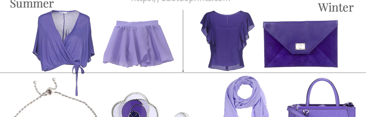
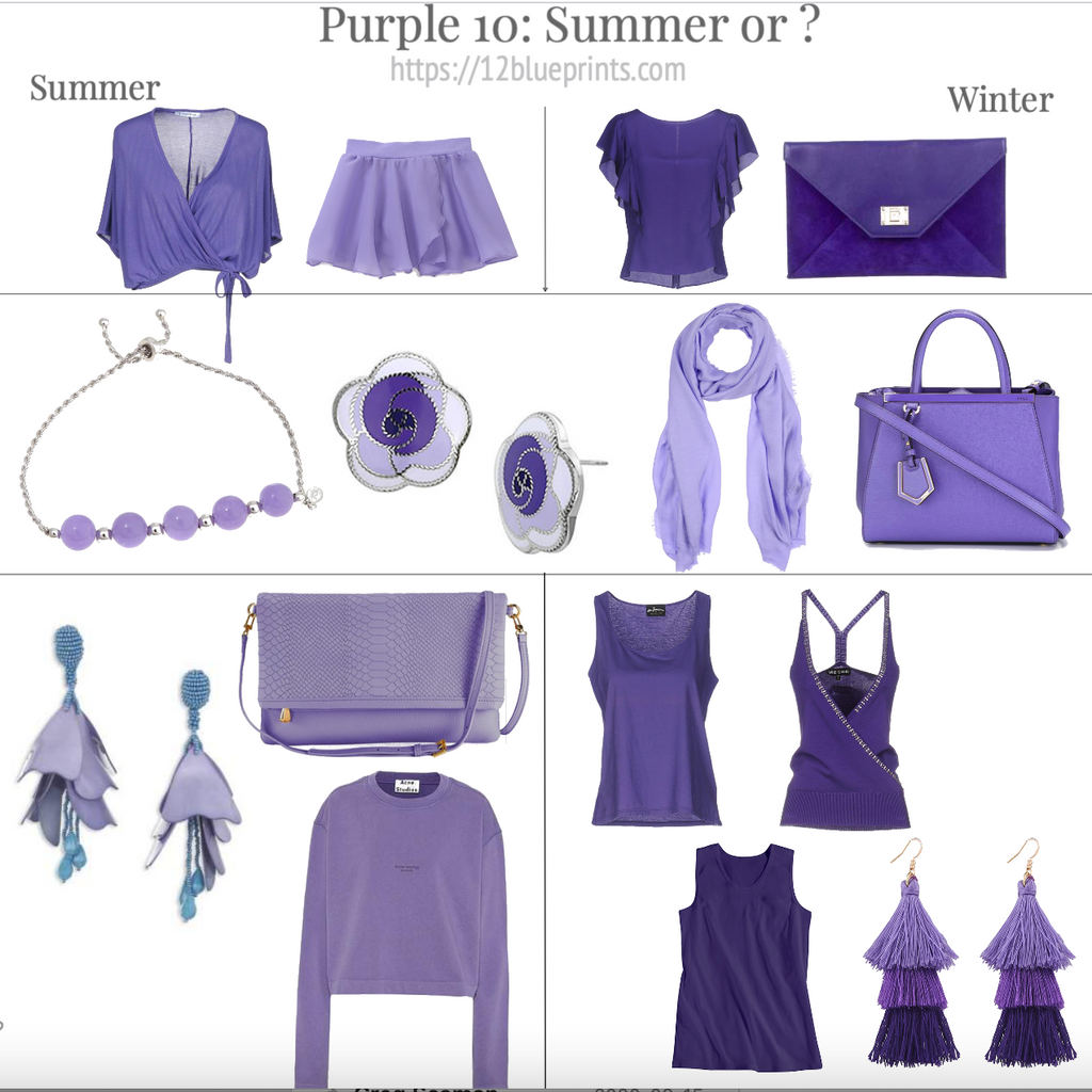
Purple 10: Summer or ?
We’ve kept a few items from where we’ve been, as though you bring some of your own items shopping.
In the top row on the L, we have two new Summer items for reference, the wrap top and skirt. On the R, the Winter side, we have two reference items that we’ve seen already, the sheer top and the bag. First impression for the sheer top, it appears more Winter, with a lot of pigment for that level of darkness.
The second row shows a brightness progression of light to medium purples, beginning on the L with the Light Summer bracelet from the Summer panels. Next are the earrings, which look nicely Summer for the medium violets, but the pure white edges may be sharp or bright for a Summer. Jewelry is expected to have shine, the colours are cool, and silver is good. One thought with an earring is whether teeth might appear yellower, given where they are worn, in the same way that eye colour and blush are seen together. Not saying teeth would instantly yellow, just that nobody’s teeth are that white in the comparison. In a bracelet, might be fine. And if the areas that appear white are actually transparent in this item, these earrings could work well for Summers.
The scarf is distinctly brighter. Summer is a pastel Season, meaning softened with gray, and more flattered by pastels than colours that contain pure white or have a synthetic quality. The stones in the bracelet on the L are better.
The bag, also bright, a Winter item. Suppose a Light Summer wanted a statement handbag. There are similar (softer) purples in the palette (and the earrings on the L) and this colouring wears brightness well. As an accessory, like a flip flop or backpack, this could be a fun choice. It will be the first and last thing people see, but it might have more affinity for the person and their wardrobe than if an Autumn carried it.
Third row, L side, we have the Soft Autumn sweater from previously and two new items, the earring and handbag. The petals in the earrings, look Soft Summer and the turquoise accent in the earrings adds interest without changing the overall effect, blue-green easy for Summers. The bag is softer and cooler than the sweater beneath and also looks like a Soft Summer colour.
Third row, R side, in the top two items, we have a tank top from Panel 2 for Summer. The racerback cami appears to more Winter. In the row below, the sleeveless top would belong better with Winter in the top row, for the darkness and amount of pigment. If we placed the Soft Summer handbag on the L with it, the top might appear darker than it is, which might also happen worn by a Soft Summer person or next to their clothing.
The earrings, which we saw in Purple 4, look more Winter. The top tier colour might be possible for Summer but the lower two tier purples appear too red or dark.
Shopping information: https://urstyle.fashion/styles/3488869
Purple 11: 4 Season Magic and Mystery
Colour talks just by being there but purple is special. It’s the colour of magic and mystery, of majesty and play. It’s in shadows and sunshine, in iridescence and outer space.
Purple can also be a relaxed colour, in kids' accessories, crocs, summer handbags, a place where rules matter less, a colour for expanding our creative side and closet.
Winter
In this section, we have a purple hat, an envelope bag that glitters like the night sky, and another bag with a flower design like a blooming flower tea, as if the design were unfolding. Jewels and purple are at home in Winter, in the necklace and earrings.
Spring
We have a pendant necklace with a beautiful stone, the lovely cream pearl chain, and an adorable bumblebee detail. The bag is softer and bluer, nice choice for Light Spring.
Also for Light Spring, the clear frame sunglasses with a hint of the rosy orange that often appears in the hair tones and freckles, and for Bright Spring, a more metallic neutral tone in the sunglasses with the blue violet lens. Lenses are the larger front facing part of sunglasses and I appreciate when the lens colour is belonging with the Season, and that these frames are the neutral parts and the lens is the colour, usually other way round.
The fiesta earrings, with the orange, fuchsia, blue violet, touch of black, and gold metal, might look terrific for Bright Spring.
Autumn
For Soft Autumn, the sunglasses in the upper R corner, with a burgundy and yellow spin on tortoiseshell in the frames, looking like the rings in a tree trunk, along with the soft periwinkle lens. The sunglasses in the lower L corner are darker and more pigmented, with black and rich gold, burgundy cherry lens, a good choice for Dark Autumn.
The watch brings to mind medieval astronomy, with a red burgundy strap and face, and brassy gold hardware. The design feels symbolic, as if it could spin. In the bracelet, we see purple in the iridescence, uncommon with moss green, denim blue, and rich gold.
How many Autumn men bought the bathing suit shorts? They would have looked so good. Fantastic purple and dark olive, well balanced, and they’re just board shorts.
Summer
The sunglasses are similar to Bright Spring above, in a softer gray, less metallic looking. The lens is gray green, like Summer khaki and a version of green that sometimes appears in the eyes of the three Summer types.
The colour reflected on the face by umbrellas can show both person and umbrella to great advantage when the colour is harmonious with the colours within the face. The white and black in the design won’t be a problem in this item and their coolness works well with soft pinks, blue greens, and the magical spirit of hummingbirds.
The soft blue-violet pendant below is a beautiful colour, with the spontaneity, strength, and risk of the sparkly vine growing down the stone, asking a little more of the viewer. Silvery gold textured metal and lightweight design work with the purple to give a simple stone a story of its own.
The tank top in soft grays, white, blue, and purple, looks like a spray or swirl. Water-associated prints are among the best ways to showcase Summer colours.
The butterfly is made with light silver metal and softly coloured stones, for an effortless understanding of why this person is wearing this item; an easy fit for Light Spring as well.

Shopping information: https://urstyle.fashion/styles/3488885
-